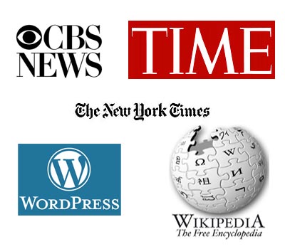
Take a look at most media logos and you’ll see they usually have one thing in common — serifs. Serifs are small strokes or lines that extend from the ends of letters. They can look like small feet, caps, tails, flags or dots. Serif typefaces are sometimes referred to as Roman typefaces. In the Roman alphabet, serifs originated with the carving of words into stone in ancient Italy. Artisans would carve out a bit of extra space at the end of the long strokes of letters to prevent gravel and dust from collecting in the corners of the letters.
Serif fonts have been used for centuries in printed books, magazines and newspapers, and are the preferred fonts for text that has a humanistic theme. It is widely believed that serif fonts make long passages of text easier to read, hence their use in newspapers and books. Serifs convey a more traditional mood, one that many vertical-format newspapers continue to use to create a harmonious appearance with their more traditional layout.
With that said, it is easy to see why media organizations often use serif typefaces in their logos. It makes sense to use a font that is so commonly associated with print media and one that so easily conveys the “more traditional mood” of books, newspapers and magazines. It’s important to note here that many online and tv media organizations use serif typefaces in their logos as well. Common serif typefaces include such fonts as Times New Roman, Rockwell, Old English and Georgia.
INFORMATION IN THIS POST WAS TAKEN FROM THE FOLLOWING SOURCES:
Designing for Newspapers and Magazines
Using Typefaces
How To Select Fonts For Your Website
Serif – Modern