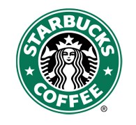
The Starbucks Company is the most famous brand of coffee in the world. The company is basically an association of two companies who merged themselves together; hence the logo is a combination of both of them. Today the Starbucks logo is recognized all over the globe for its excellence. Imprinted on the coffee mug, the Starbucks logo itself represents quality and standard.
The company was founded in 1971, since which it has followed a number of paths of development and evolution. The two pioneers were IL Giornale and Schultz, who combined in 1987 and gave it a new name of Starbucks Corporation. The early logos had IL Giornale over it and then the Starbucks logo formulated itself to the one we see today with a Siren.
Design Elements of the Starbucks logo:
The Starbucks logo features a Siren which is a slightly evoluted one but still maintains its history and tradition with which the company first made its way to fame. The latest Starbucks logo takes care of the dignity and reputation of all.
Shape of the Starbucks logo:
The shape of the Starbucks logo is circular with another circle within it. The fonts are written inside with the stars alongside together emerging as an elegant picture. Moreover it highlights the presence of a Siren which symbolizes the originality of the Starbucks logo.
Color of the Starbucks logo:
Plain colors used in the Starbucks logo characterize the simplicity of the logo. The only colors used are black, white and deep green. The two tailed mermaid is a combination of black and white, while the green color forms the background of the fonts.
Fonts of the Starbucks logo:
The fonts of the Starbucks logo are caps locked, simple and yet stylish attracting the people of all age groups. Written as ‘Starbucks Coffee’ there are stars present in between the two words.
Coffee is something the whole world is craving for. The Starbucks Coffee is a known brand for this which strengthens its feet in the ground of beverage industry as the time passes. The Starbucks logo is not only well renowned but also symbolizes the peak that company has been able to touch in the years.
Related blog post(s):
Logo Of The Week: Starbucks Entertainment
Logo Look-Alikes: The Clone Wars