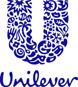
Unilever is a multinational consumer goods company that manufactures personal care products, beverages, food, and cleaning agents. The present Unilever logo was first introduced in the year 2004 and was designed by the brand consultancy Wolff Olins. The Unilever logo consists of 24 icons creating a U shape. Each icon represents the company’s core values. Its brand identity was developed bearing the company’s idea and goal of adding vitality to life.
Design Elements of the Unilever Logo
The Unilever logo is composed of 24 icons that come together to form a U shape. Each icon signifies certain aspects of the business. Here are some of the most essential icons of Unilever.
SUN. The sun tells about where Unilever first started: Port Sunlight. Aside from the company’s origins, the sun also represents quite a lot of Unilever’s brands, like Slim-Fast, Flora and Omo, which use radiance in order to expound the benefits they offer.
FLOWER. The flower here stands for its capacity to give fragrance. Together with the hand, the flower symbolizes cream or their personal care product line’s promise to moisturize the skin.
HAND. The hand in the logo symbolizes care, sensitivity, and need. It also represents the skin and the element of touch.
DNA. This icon, the genetic blueprint of life or DNA, symbolizes the bio-science which is known to be the key to having a healthy life.
HAIR. Hair represents beauty and the feeling of looking good. If the hair icon is placed near the hand, it represents softness while it represents fragrance and cleanliness when placed next to the flower.
SAUCES OR SPREADS. The creation of different products involve mixing or stirring, exactly what the icon represents. This icon depicts that act of adding taste by blending in certain flavours.
BIRD. The bird symbolizes freedom, suggesting a pause or relief from your daily routine and letting oneself enjoy life a little bit more.
CONTAINER. Unilever makes sure that their products are handled with care inside out.
FROZEN. This is a transformational symbol, representing freezing and freshness.
RECYCLE. Unilever is into maintaining cleanliness, making recycling a part of the company’s commitment to sustainability.
WAVE. Just like what most of their products offer, the Wave icon represents vigour, cleanliness and freshness.
It wasn’t until 2004 that Unilever actually unveiled the meaning of their logo. Avid Unilever fans have been very curious about what the U shape icon really represents. Overall, the Unilever logo promotes transformation and satisfaction for customers, believing that they deserve every bit of the good life.