Formed in the late 1960s, Pink Floyd is one the world’s most successful progressive rock bands from England, selling over a 200 million records worldwide. Nick Mason and Rick Wright met Roger Waters in an architecture course at Regent Street Polytechnic in London and they jointly formed a band along with the other musicians including Clive Metcalf, Keith Noble and Juliette Gale. The band was originally named “Sigma-6” however later when Bob Close and Syd Barrett joined the band; the band’s name was changed to “Pink Floyd“, taken from one of Barrett’s recordings with Pink Anderson and Floyd Council (of blues players).
The band has received a notable acceptance from its millions of fans all over the world for producing tremendous compositions with a blend of thoughtful lyrics, innovative album art, and dynamic, lavish stage performances.
The most popular albums by Pink Floyd include “The Dark Side of The Moon” (1973), “The Wall” (1979) and “Wish You Were Here” (1975).
DESIGN ELEMENTS OF THE PINK FLOYD LOGO:
Pink Floyd, like many other top classic rock bands, has had a variety of logos and images associated with their music, which we see across the websites and T-shirts, bags, key chains etc. of many of its huge fan base.
Shape of the Pink Floyd Logo:
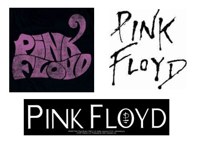
All three Pink Floyd logos shown above appear quite different from one another in the sense that each has a certain feature that grabs the attention of people; with the first one comprising of only the bands name, while the second one appears in square-shaped box enclosing the band’s name with the “K” in “Pink” stretched slightly outwards attracting immediate attention. The last but not the least is the third one, which is the simplest of all, yet eye-catching, because of the small icon appearing in the “O” of “Floyd”.
Color of the Pink Floyd Logo:
The common colors used in all the three Pink Floyd logos are black and white, conveying the fact that the band logo is simplistic yet legendary. Pink color represents innocence.
Font of the Pink Floyd Logo:
The fonts’ styles in the first and third are straightforward yet chic. The second logo uses a funky styled font which is its distinguishing feature.