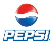
The Pepsi logo is not only one of the most well renowned logos but also one of the logos that have evolved greatly over the period of time. Over the 100 years of success Pepsi cola company still standout in the beverage industry, despite the ever increasing competition in the market. Like it did years before, Pepsi Cola Company still remains successful in providing its users with a sense of satisfaction and quality.
Started on 16th June 1903, the logo still remains the same but with little innovations. The founder of the company, Bradham was the founder of the Pepsi logo which was first a scribble. Later when the drink gathered fame, he decided to formulate the logo and it now appeared as a better version with more defined curves. The most visible changes in the Pepsi logo occurred in 1940 and 1950, when the original red logo was given red and blue colors and a slightly modified shape. Later in 1962, the logo comprised of only Pepsi written to it, with cola omitted from it. Finally in 1998, when the company celebrated its 100 years of success, the Pepsi logo changed into a sphere and still remains today.
Design Elements of the Pepsi logo:
Despite the advancement in the Pepsi logo, the design yet remains a unique one. The colors together with the selection of shape and font produce an exclusive picture of a company as victorious as the Pepsi Cola Company.
Shape of the Pepsi logo:
The shape of the Pepsi logo is a three dimensional globe, with two completely opposite colors and a swirl in the middle, separating the two halves of the globe. The fonts are written alongside, giving it a fairly simple structure.
Color of the Pepsi logo:
The Pepsi logo includes two distinct colors having their own beauty. Fonts appear in white. One hemisphere is colored red while the other is blue, together with blue background with chills, produces a very tempting picture that the product is worth of.
Fonts of the Pepsi logo:
The fonts of the Pepsi logo are simple, roman and italicized looking prominent as well as elegant.
Related blog post(s): 7 Logo Redesign Disasters
I think that this website is so cool how there logo uses so many different name brand and there letters.