Metallica is a successful heavy metal American band formed in Los Angeles, California in 1981 by the drummer Lars Ulrich and rhythm guitarist and vocalist James Hetfield. Both musicians had been looking to start a band, and placed ads in the magazines and hired bassist Ron McGovney to join them in playing music that was influenced by such acts as Led Zeppelin, Black Sabbath, Iron Maiden, Judas Priest and the like.
The band has successfully sold over a hundred million albums worldwide and is one of the most successful commercial heavy metal bands in the music history. The most popular albums released by Metallica include “Master of Puppets” in 1986, “Ride the Lightning” in 1984, “Kill ‘em all” in 1983, and “And Justice for All” in 1988. Their last album consisting about thirty tracks was released in 2008 by the name of “Death Magnetic”.
DESIGN ELEMENTS OF THE METALLICA LOGO:
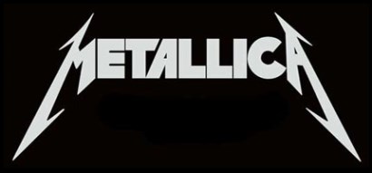
Metallica Logo is undeniably one of the most recognizable logos in rock music.
Shape of the Metallica Logo:
The shape used in the Metallica logo gives it a very rock and roll type image. The shape of middle letters of the logo starting form “E” to “C” is kept pretty simple as compared to the spiky look given to the “M” and “A” making the Metallica logo easily recognizable everywhere.
Color of the Metallica Logo:
The colors (silver and black) capture the essence of the band as a heavy metal band and the maroon-brown basically shows subtle richness found in Metallica compositions.
Font of the Metallica Logo:
The font used for the Metallica logo is created by Ray Larabie and is known as “Pastor of Muppets”.