The history of automobiles was eternally changed after the two companies, Benz & Cie and Daimler Motoren Gesellschaft (DMG) amalgamated to form a new entity namely Mercedes Benz. Both the companies were each others rival however due to the financial crisis after the World War I, the companies decide to merge and promote the sale of their product.
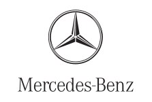
Nevertheless, the new born company required a new logo design. Thus, the Mercedes logo was shaped to serve as the sole identity for the company. Mercedes logo is now one of the most recognizable logo through out the world. Originally created by Gottlieb Daimler, the Mercedes logo is a simple design that reflects class, integrity and personality.
Design Elements of Mercedes Logo:
Mercedes logo is famous due to its prominent features and also because of its decent and sober appearance. It has undoubtedly ruled the corporate market ever since it was designed.
Shape of Mercedes Logo:
Since the beginning, Mercedes logo has gripped the three sided star which elucidates its dominance over sea, land and air. This three- pointed star is enclosed in an orbit defining the logo at its best. Mercedes logo was especially designed to outline the ability of the motors for land, sea and air usage.
Color of Mercedes Logo:
Mercedes logo features a metallic gray hue that depicts the healthy corporate image of the corporation. Metallic gray is the color that best represents the company and its products. Mercedes logo is tinted in blue shade in the beginning of its journey. However, now it enhances the abilities of the firm with the metallic gray color.
Font of Mercedes Logo:
The signature of the company is arranged in a much uncomplicated typeface in Mercedes logo. The simplicity of the Mercedes logo font depicts the strong image of the company and also defines the innovative performance of the products. This typeface is a sole symbol of status, authority and authenticity.