The journey of the British heavy metal band Iron Maiden dates back to the year 1971 when young Steve Harris became inspired by the music of Wishbourne Ash, Led Zeppelin and Jethro Tull, so he later formed his own band in 1975, starting as a bassist and songwriter. The current line-up of the band, besides its founder, includes Bruce Dickinson as the vocalist, David Michael Murray as the guitarist, Adrian Smith and Janick Gers as the two other guitarists, and Nicko McBrain on drums.
Iron Maiden is one of the most successful heavy metal bands in the history, with their unique approach and innovative musical style of progressive metal which is both ear-catching and lingering. Most people probably don’t know the fact that a lot of their songs are founded on historical events including those about Alexander the Great, The Flight of Icarus and the like. Their music is groundbreaking and infinite with the release of fourteen studio albums and selling over 100 million copies worldwide.
“Dance of the Death”, “Brave New World” and “Powerslave” are some of the most famous songs that have gained immense popularity among their fans.
DESIGN ELEMENTS OF THE IRON MAIDEN LOGO:
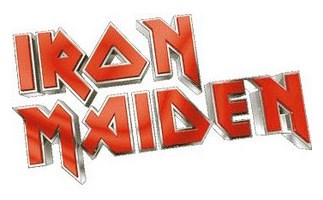
Iron Maiden logo displayed above is very distinctive and was used on all Iron Maiden releases until 1995’s The X Factor. Later it was used again on the official releases with pre-1995 material.
Shape and Font of Iron Maiden Logo:
The distinct shape of alphabets (especially that of “O”) in the Maiden logo superbly depicts the heavy metal imagery the band is closely associated with. The Iron Maiden logo has probably sold bigger amounts of T-shirt and merchandise sales than most of the other metal bands. The font used is Metal Lord and indeed gives the Iron Maiden logo a slick metallic touch and finish.
Color of the Iron Maiden Logo:
The grey and red colors in the font signify passion, strength and refinement.
The distinctive features of the maiden logo indeed classify it among the best rock band logos of all time.
The font may be be known as Metal Lord these days, but the Iron Maiden logo was actually designed by Steve Harris himself. Before he formed the band he was a draftsman.
(That’s Wishbone Ash too)
Iron Maiden logo on “X Factor” was still the same – except the colours of course. I think it is quite natural that simplified logo versions co-exist too. Nevertheless, cover art of the album was not designed by band’s long trusted artist Derek Riggs, so they – I guess – wanted to do “something” with the logo too to keep the photorealistic feel of the cover art consistent. Well. I did not like it.
I think even more significant (=typographical) change of logo design was made onto cover art of next album “Virtual XI” where all descenders were cut-off. Colouring was horrible and after since we have not seen the most well known red white version of logo.
;-(
Blah! What the heck, it is their property after all 😉