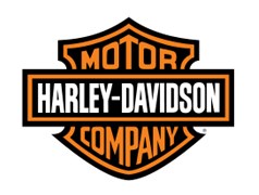
The Harley Davidson Company began as a manufacturer of motorcycles but now is more of a brand. The Harley Davidson logo today is not only seen on motorbikes, but also on shirts, belt buckles, pens, posters, wallpapers etc. Today the logo remains as a powerful and a famous sign among the young specially the males, inspired by the evergreen love of bikes and automobiles among this age group.
The Harley Davidson Company was started by William S. Harley in 1902. Together with Arthur Davidson, in 1903 they assembled their very first two-cylinder motorcycle, marking the beginning of the Harley Davidson. The Harley Davidson logo was created in 1910 and since then did not evolve much. More commonly known as the ‘bar and shield’ logo, it is renowned all over the world.
Design Elements of the Harley Davidson logo:
The uniformity and simplicity of the Harley Davidson logo is a proof of its success, growth, popularity and development over the past 100 years. The logo is unique in its design and also attractive.
Shape of the Harley Davidson logo:
The shape of the Harley Davidson logo is a bar and a shield, which is how the logo is more commonly known as. It features a shield over which lies a bar, both coming together in a very attractive manner.
Color of the Harley Davidson logo:
The Harley Davidson logo includes black, white and orange color, giving a very strong contrast. The background stays black while the fonts are written in orange on the shield and in white over the bar, presenting a picture of solidarity and elegance.
Fonts of the Harley Davidson logo:
The fonts of the Harley Davidson logo are simple and caps locked. The bar shows fonts of the same size while the size changes sequentially in the shield. Nevertheless they are simple and bold enough to catch all the praise the brand is worth of.
Harley Davidson, as well as most motorcycle related companies advocate safety gear to protect riders. Be sure to always wear a helmet and protective gear. If you do not have a helmet, buy motorcycle helmets now for you and passengers, so that you will be protected as you ride.
can anyone tell me when & why they changed the HD logo (full winged eagle) they changed its head from looking to the right to looking to the left