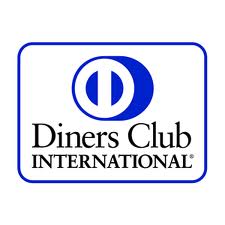
 The Diners Club International logo is a globally recognized icon. The company is owned by the Discover Financial Services, which is a known direct banking and payment services company. The Diners Club International was established in 1950 and it became the very first multipurpose charge card in the world as they revolutionized the way the consumers and companies pay for certain services and products.
The company is one of today’s globally recognized brand that serves the payment needs of consumers. It offers approximately 450 airport lounges around the world.
Design Elements of the Diners Club International Logo
The Diners Club International has retained its current logo for quite a long time already. But its meaning has remained a mystery for everybody. It’s now time to unlock the meaning behind the logo.
Color of the Diners Club International Logo
The Diners Club International logo has a blue background. The color blue in the logo represents loyalty to their clients as well as the confidence and trust of their clients in them, and their commitment to perform their responsibilities. Blue is also a symbol of tranquility. The Diners Club assures their clients with the comfort of life and peace of mind in terms of their finances, through the various products and services that they offer.
Shape of the Diners Club International Logo
The shape that is used in the Diners Club International logo is the circle. The circle has no end nor a beginning. They symbolize the eternal whole and are commonly used to suggest familiar objects. They mean well-roundedness and completeness. Through the circle, the Diners Club International sends the message that they have the complete set of services fit for all kinds of people. Circles also symbolize protection. The company wants their clients to know that they can be trusted and will protect their clients’ interests at all costs.
Appearance of the Diners Club International Logo
The Diners Club International logo appears to be a “back-to-back” letter D. This is the symbol of Diners Club. The position of the letter suggests that they have their customer’s back at all times.