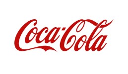
The Coca-Cola company has the most widely distributed and well-known soft drinks in the world. John S. Pemberton originally invented the drink as a medicine in 1885. The Coca-Cola logo was created by Frank Mason Robinson in 1885.
Much like the Coca-Cola logo itself, its bottle remains distinct in its design and layout. Created in 1915 by Earl R. Dean, the Coca-Cola bottle came as a ‘contour bottle’ or ‘hobble-skirt’ bottle, wide from the middle and narrow from the bottom. The bottle’s design was to resemble the two ingredients, coca leaf and cola nut, but instead the founders were motivated by the gourd-shaped cocoa pod. With the passage of time and the advancement in the technology, the Coca-Cola Company introduced the aluminum can much appearing like the first designs of the bottle, but generally remained infamous. In 2007, the Coca-Cola logo slightly changed and remained a simple white and red swirl. Moreover, in 2008, plastic bottles of 1.25 and 2 liters were introduced maintaining the old shape of the bottle with a plastic screw cap.
Design Elements of the Coca-Cola logo:
The Coca-Cola logo, like the brand itself, is recognized globally. The characteristic design with a white swirl and a cursive style revives the youth spirit.
Shape of the Coca-Cola logo:
The Coca-Cola logo comes in a rectangular shape or a circular shape with the hobble-skirt bottle on top. The rectangular design is a fairly simple one with a cursive font and the swirl.
Color of the Coca-cola logo:
The only two colors used in the Coca-Cola logo are red and white, both appearing vibrant nevertheless simple in design as well as tempting the youth minds. The fonts are written in white with an energetic red background.
Font of the Coca-Cola logo:
The font of the Coca-Cola logo is a fancy one, with a cursive style. Both the C’s appear distinctive to each other. The white swirl beneath the fonts not only gives it a unique feature but also highlights its simplicity.
Related blog post(s):