Cisco Logo
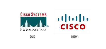
The original Cisco Systems logo featured a white bridge, made of a variety of different sized lines against a dark background. The words “Cisco Systems” was above the bridge in red font. The bridge is fitting, because the company was named “Cisco” after San Francisco, and was named after the founders drove passed the Golden Gate Bridge on their way to register the business.
The Cisco Logo was designed under the direction of Gary McCavitt, an employee of Cisco Systems in 1990. Gary McCavitt was the director of Brand Identity.
The Cisco logo was updated in 1996 by Joe Finocchiaro and Jerry Kuyper. While keeping the basic intergrity of the logo, the new logo was simple and modern. In the new Cisco logo, the bridge is the same basic shape, but with fewer, simpler, bolder lines. The bridge is dark, instead of white. The red word “CISCO” in all capital letters is below the bridge, and it is on a white background.
logo Cisco Systems, Inc is a leading consumer electronics and technology company. It is a worldwide company that is based in San Jose, CA. It was founded in 1984 by Len Bosack and Sandy Lerner. In the early years of Cisco Systems, Incorporated, the name “cisco” was not capitalized, because it was an abbreviated version of San Francisco. In 2011, Cisco Systems, Inc reported a $43.21 billion revenue.
