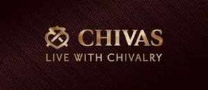
The Chivas Regal is a world-famous blended Scotch whisky that was produced by the Chivas Brothers. They first established the company in the year 1801 and is now owned by Pernod Ricard. Their first store sold luxury food ranging from exotic spices and coffee, Caribbean rums, and French brandies. They usually have wealthy clients back then. As they became famous for their deliciously blended drinks, they were granted a Royal Warrant to supply goods to the great Queen Victoria in 1843. The business became even more successful and in 1890, Scotland has pronounced Chivas Regal as the finest selling brand in Scotland.
In today’s market, Chivas Regal is the leading Scotch whisky in Europe and in the Asia Pacific. Its sales has grown by 61% in just over six years. It has performed well in the Spirit competitions and in 2012, it has been awarded its Gold and Double Gold Medals for their 18 year and 25 year whiskies. Chivas Regal has been selling three major products: the Chivas Regal 12 years, the Chivas Regal 18 years, and the Chivas Regal 25 years.
Design Elements of Chivas Regal Logo
The Chivas Regal Logo has kept its roots as they change the logo’s color only when they introduce a new taste. But whenever they introduce something new to the market, they make sure that the brand, through its logo, reflects this new innovation.
Color of the Chivas Regal Logo
The color red itself symbolizes the color of life. With the whiskies that Chivas Regal is making, the customers will get to appreciate and enjoy life more. Aside from that, the color of the Chivas Regal logo is also used to get the attention of more customers.
Symbol of the Chival Regal Logo
The new Chivas Regal logo has the symbol in the form of a luckenbooth in it. This symbol is a traditional Scottish love token. This means that the company makes their products with love and passion. This symbol can also be seen in the gate of their distillery.
Words in the Chivas Regal Logo
The font used in the new logo represents a more sophisticated version of Chivas Regal.
