CBS Logo
In 2011, CBS celebrated the 60th anniversary of their Eye logo. The logo was first introduced in 1951 and while the CBS logo has changed over the years, it has stayed true to the integrity and design of the Eye logo. The Eye logo has since remained the emblem that represents CBS. The network is even sometimes referred to as the “Eye network”.
CBS, Inc (formerly known as Columbia Broadcasting System) is a commercial broadcasting television network that started as a radio network. William S. Paley first bought a collection of radio stations in 1928. It quickly became one of the largest broadcasting television networks in the United States.
The CBS logo was designed by the famous graphic designer William Golden back in 1951. It is designed entirely of circle components and is one of the most famous corporate logos in all of history. The symbol of the human eye is not a new concept, but CBS (and William Golden) managed to create an elegant and sophisticated form that has withstood the test of time.
The first CBS logo is the black eye with CBS in white writing in the center of the pupil. The unveiling took place on October 20, 1951. The “black eye” was floating o a background with black and white clouds.
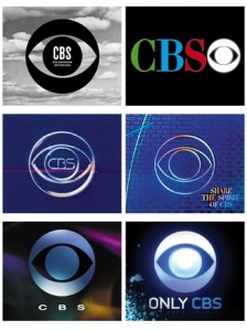
Below is a few of the logos that CBS has sported over the last 60 years. The eye has stayed true to the network and brand of CBS and is still being used by CBS.

