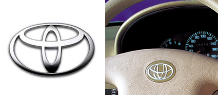
We’ve all heard the saying “great minds think alike.” This is true more often than not for logo designers. And while designers often get inspiration from other designs, if not done in the right way, it can spell disaster for their clients. Below are some examples of what can happen when designs start to look too much alike.
Toyota vs. Geely, 2003
Toyota accused Chinese carmaker Geely of using a logo similar to theirs in its Meiri sedans. The company asked Geely to stop using the logo, citing that it could mislead customers. But after their request went unanswered, the company decided to file a lawsuit against Geely.

Starbucks vs. Starpreya, 2007
After taking legal action against Starpreya, the Supreme Court rejected a claim by Starbucks that the Korean-based local mobile coffee shop chain infringed on its trademark rights by using a similar brand name and logo. The Supreme Court upheld an earlier decision handed down by the Patent Court of Korea, stating that the two trademarks and logos were not similar.

Apple vs. VSBT, 2008
Lawyers for Apple sent a letter to the Victoria School of Business and Technology (VSBT) claiming that the school’s logo was similar to theirs. VSBT, however, disagreed.

RE/MAX vs. Rehava Real Estate Store, 2009
A dispute erupted over a trademark request filed by Rehave Real Estate Store. RE/MAX challenged this request, stating that the Rehava name and logo are too similar to its own. Rehava, however, saw little if any resemblance at all. Legal counsel for RE/MAX offered an explanation: “First of all, both names start with ‘r’ and have logos with accent lines near the letter ‘e.’ It goes beyond that. If you chop the top off the ‘h’, you almost have the ‘m’ in RE/MAX. The next letter is an ‘a’, and if you take the ‘v’ then you have half of an ‘x’.”

ThinkFree Office and Google Chrome
There weren’t any disputes over this one that I know of, but I thought I would throw this one in there since there had been some controversy surrounding these two designs. The ThinkFree Office design came first.

WHAT DO YOU THINK?
Do you agree or disagree with the claims made and actions taken in the above examples?