Metro-Goldwyn-Mayer, widely known as MGM, is a leading American production house paving its way towards prosperity since 1924. It came into being by the entertainment entrepreneur Marcus Loew who acquired hegemony over Metro Pictures, Goldwyn Pictures Corporation and Louis B. Mayer Pictures. Loew merged these three production companies and formed the now well-known Metro-Goldwyn-Mayer media company. Ever since the company was born, MGM has retained a definite and impressive logo design to demonstrate the power of the corporation.
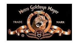
MGM logo is genuinely presented with Leo the Lion which has rather become a mascot for the Hollywood production house MGM. Leo the Lion is the chief feature portrayed in the MGM logo which depicts the high corporate image of the firm. MGM logo has abide some alterations but the logo design has never lost its worth. It still continues to project the same notion of class, credibility and durability as it used to reflect when it was first created. With the passage of time, the postures of the lion were altered to some extents but the originality of the MGM logo did not bear any variation.
Design Elements of MGM Logo:
MGM logo is one of the best logo designs known throughout the world that demonstrate power, strength and intensity. It has been molded in a remarkable shape with some elegant twisted ribbon expression.
Shape of MGM Logo:
Ever since MGM logo was shaped, it has preserved a unanimous shape. Leo the Lion, captured in the circular ribbon work, is the major feature of the MGM logo which enhances the beauty of the pre-eminent logo design. The structure of MGM logo is immensely stylish and graceful, clearly reflecting the bright segment of the company.
Color of MGM Logo:
Use of incredibly bright hues is restricted in the MGM logo. The color of the lion is kept very natural and illustrates a highly established image of the firm. The elegant ribbons used in the MGM logo are of matte gold shade which again signals notable market picture.
Font of MGM Logo:
Typeface of MGM logo has always remained simple to cast an extraordinary impression on the spectator. The simpler the text font is, the easier it becomes for the viewer to understand the logo design and remember it. Plain font type reflects the well establishment of the corporation and yet showcases a high commercial value.
Related blog post(s):
Scary TV Logos From Your Childhood
The Basics Of Three-Dimensional Design