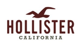
The Hollister Company (or simply Hollister) is a popular American lifestyle brand owned by Abercrombie & Fitch Co. The company targets customers in the age group of 14 to 18 years. Its popularity is evident from the fact that it was ranked as the second most preferred teen clothing brand behind a long list of actual west coast companies in 2008 by US Bancorp Piper Jaffray. It focuses on one central theme for both dudes and bettys–the surfing lifestyle in South California. The Hollister style is casual and laid back. It is perfect for the young people who lead audacious and rugged lifestyles.
Hollister’s story is based on a fictional character named John M. Hollister who is an adventurous young boy and he spent his youth practicing sports in the waters of Maine and later founded a merchant shop in Southern California in 1922, which he named after himself. The idea behind this story was to set the brand apart from others and help it gain instant recognition.
The company’s first store was launched in July 2000 at the Easton Town Center in Columbus, Ohio.
DESIGN ELEMENTS OF THE HOLLISTER LOGO:
The Hollister logo is an example of a good professional logo. It is designed very thoughtfully as it truly depicts the brand’s identity and origin.
Shape of the Hollister logo:
The Hollister logo features a flying seagull which is usually associated with sea coasts.
Color of the Hollister logo:
The maroon color in the Hollister logo relates to joy, courage and strength which are the traits associated with the fictional character, John M. Hollister, created by Abercrombie & Fitch Co,.
Font of the Hollister logo:
Besides the flying seagull, the Hollister logo also comprises of the brand name itself and its origin so that customers just have to look at it and relate it with the interesting story of John M. Hollister. The font is simple yet gives an instant recognition to the brand.